Hi everyone,
I’m running the clustering example in Geant4-DNA. Does anyone happen to know what the axes of the graph that is produced from the outputted root file is? I’ve attached a photo.
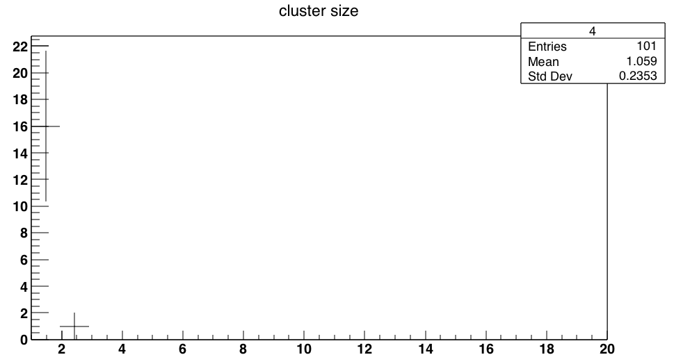
I think it is the number of ionizations scored in each 10 bp-long cylinder, but I am not sure and just want to confirm. Please let me know. Thank you very much!
Alaina